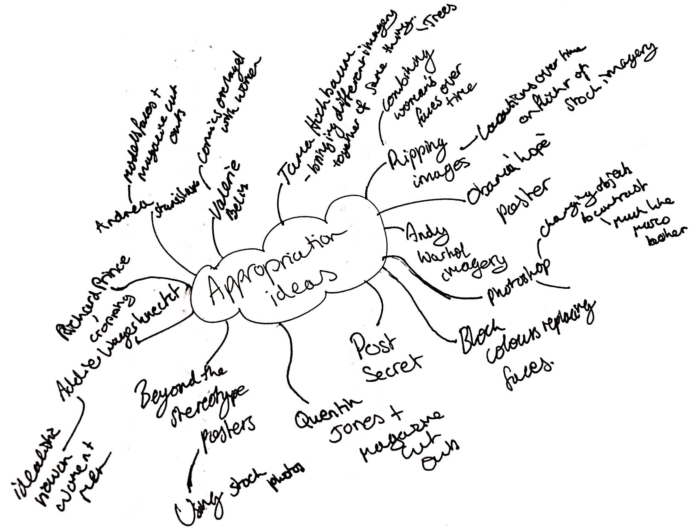
Initial Research and Mind Map:
To start off the project I wanted to create a mind map of all my ideas and artists which I had looked at and who inspired me so that I would have a better understanding of what I wanted to create and how I was going to go about it. Here is my mind map:
I liked the idea of thinking about the different iconic women through the years and combining them all together to amplify the differences between them all and show how the standard of beauty has developed throughout history. When thinking about how I could combine all the different women together, which is when I came across this image of Mona Lisa mixed with the famous portrait of ‘The Afghan Girl’ by Steve McCurry:

Artist Research:
After I found that initial image I started my artist research and came across a number of different artists which all worked with existing imagery or a number of images and brought them together to give it a different context or to make a mockery of the existing image.
John Clang:
John Clang was born in Singapore in 1973, he is a visual artist working mainly with photography and film. He used to serve in the army however now currently lives in New York and Singapore. Clang’s focuses on time, displacement and existence in his works which begins to examine and ask questions about the world. He likes to provide his viewer with a mental reflection on his view of life rather than a pictorial and factorial view. His first exhibition at the age of 20 was the first of many, as he has shown his work throughout the world with permanent collections in the Singapore Art Museum.
His collection entitled ‘Hopenhagen’ brings together a number of different portraits of people worldwide together to gain awareness of climate change. I like how he brings together these different people but makes their faces almost match when they are brought together to show them being united together for one cause. These images in my mind are powerful as they show the viewer how similar all humans are indicating that we should all fight for the same thing. I like how Clang chose to use people for different ethnicities and background to give the images variety and it is Clang’s way of bringing everyone together. The texture of all of his pieces in this series begin to be quite rough due to his choice of ripping up the photographs into slices and overlaying them physically over the top of each other which I really liked.


Guy Catling:
Guy Catling focuses his graphical work on collages where he takes old photographs and makes them new again. He uses a variety of vibrant and intricate patterns to make the old black and white photographs stand out more usually highlighting the most important section of the image itself. The drastic contrasting colours in the images make them stand out more and prove to be more interesting to the viewer. As seen he uses war photographs which have a very sombre tone about them and uses the bright colours and bold designs to combat those original images and make them more intricate and enticing. I like the overlaying effect that he created as it creates a lot of texture within the photograph.


Idea 1
Contact Sheet 1
This is my first contact sheet inspired by John Clang’s work of ripping images of different people and putting them together, I however wanted to use photographs from the internet of different iconic women through the centuries from the 50’s to present day. I wanted to use iconic women as they embodied the idealistic view of women in that time and I wanted to explore how that changed over time. I used my own homemade studio area with tungsten lighting from different angles. I chose to use a mixture of black and white and colour photographs from Google so that it gave the feel of moving through time and it could allow the colours in the coloured images to stand out to the viewer.


Here are a few of the images I decided to use from this shoot and how I edited them in Photoshop to increase their contrast and make the individual sections stand out more:


Contact Sheet 2


With this shoot I wanted to experiment more with lighting and so I used a direct small spotlight coming from the different sides of the images. I wanted to include a lot of negative space around the main images so that the viewer’s eye was drawn into the centre of the photograph and the focal point was outlined more.
Here are some of the images which I chose to edit:


Idea 2
After creating those images I wanted to look at doing something more like Catling’s work by taking images off Pinterest of old black and white photographs and cutting out important sections whilst filling them with vibrant colours and patterns. I wanted to show a different message with each image dependent on the sections I chose to cut out. Here are the ones I created with explanation for the first image.
Image 1:

Process:

1. Firstly I started out with the original image that I got from Pinterest which had a vintage look to it. I chose this image because it used the typical black and white sturcture of old photographs and I liked the point of view of the image looking straight at the subject. The photographers use of the rule of thirds also appealed to me.

2. I then wanted to cut out the boys’ shirt and the girls’ skirt so I started by using the magnetic lasso tool in photoshop to go around his outline shirt and deleting the information in that section of the photograph. I wanted to cut out his shirt because Catling did the same sort of thing with different items of clothing in his images.

3. Then I chose to cut out the girls’ skirt as it provided a contrast to the cut out bottoms of the boy to show the diference in their gender and also to amply the difference in their stances. I wanted to show that the girl standing on the boy was a lot more dominant and it is a contrast from usual depictions in the media. The magnetic lasso tool was also used for this so I could get as close as possible to her actual outline.

4. I then found a pattern online which I liked also from Pinterest which I copied and pasted under the original image so it only showed through the cut out section of the image. I wanted to make her and him have different patterns to show their differences.

5. I used lines in the boys’ pattern so it would lead up to the girl and draw the viewer’s eye up towards her. I like the contrast between their two patterns, one being round and smooth and the other being very jagged and multicoloured as it again showed their differences.

6. I then wanted to use a layer mask over the top of the image to make the girls’ skirt pink which I did through hue/saturation. I like the look of the pink colour and it suits her outfit more signifying her as a girl.

7. Due to the first hue change I didn’t really like the colours of the bottom boys’ shirt so I used another hue/saturation layer and changed it so the pink in the sklirt was deeper and had more contrast and the boy had a bit more green so that the colours complimented eachother and it was more visually pleasing.
Other images:


Evaluation:
Throughout this brief I really enjoyed looking at how different practitioners took other original images and changed their context or their meaning to be something more interesting and thought provoking. I liked Catling’s work because of how unique the pieces were and how he could transform a boring and dull image into something very bright and powerful just by adding bits of colour into different sections. I found it easy to use Photoshop to edit my second idea however I did struggle initially with the first idea’s lighting as I didn’t have the access to any proper lights so I used my torch, natural light and lighting from another larger light source to make the images appear professional. I believe this brief went very well and I liked the outcomes which are shown on the final pieces page, I think that I changed the original meaning of the images and tried to give it a second/underlying message which could be delivered to the viewer.